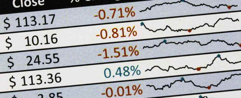
Displayed in a single Excel cell, thumbnail sparklines are used to see the trend of a data series at a glance. A nifty and practical analysis tool to energize spreadsheets.
Since version 2010, Microsoft Spreadsheet allows you to add thumbnail charts to data tables. Difficult to do more concise than these visual representations imagined by Edward Tuftean American professor of statistics: a graph sparkline fits in an Excel cell! Its purpose is therefore to help your readers identify at a glance a rise, a fall, a seasonal cycle, a minimum or maximum value… in short, a trend, sometimes difficult to detect in a long table of figures.
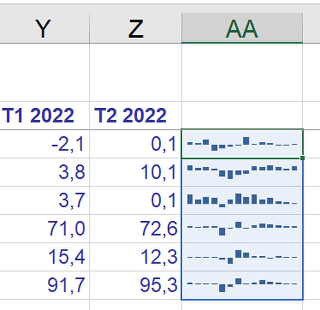
Since you have to go to the essentials, the options for sparkline charts are few. You are entitled to three representations: a curve, a histogram, or a graph to distinguish negative values from positive values. And because each chart fits in a cell, it’s easy to stack them to quickly compare each row of data at the end of the chart – a sparkline for each month of the year, for example.
Excel for Windows and Excel for Mac give you the ability to create these charts. The free online version, Excel for the web, displays sparklines if the workbook was created on a computer, but it does not allow you to edit or add them.
Google Sheets, the free online spreadsheet from Google also allows you to create these graphs thanks to its function SPARKLINE, which we will see at the end of the article.
In Excel for Windows and for Mac, creating a sparkline chart is really easy, you just need to select at least one row of data. Microsoft’s spreadsheet also allows you to select multiple rows to handle all sparklines in a table at once.
- To create a sparkline chart, for example, select a line of data.
- Or select all useful rows of a table.

- Click on the tab Insertion.

- In the group Sparkline chartsclick on one of the three graphs, for example, a Curve.

- In the dialog box Create sparklinesselect a Data range if the current selection is not correct. If there is only one row of data, click on a single cell to Slot range. Or select a range of cells in your spreadsheet to create multiple sparklines.

- The line sparkline chart is displayed.

- If needed, grab the handle in the lower right corner of the sparkline cell and drag it down to create a graph for each line of data.

- The second type of sparkline chart is obtained via the tab Insert > Histogram.

- This histogram can, of course, represent positive and negative values (illustration below). We will see that it is possible to differentiate the color of values greater than or less than zero, for example.

- If you want to focus on the positive and negative results instead, regardless of the exact value, give preference to the third sparkline chart, via the tab Insert > Conclusions and losses. The positive and negative bars are all the same height, but the offset makes it easy to spot them (illustration below).

- To make a chart even more meaningful, edit its options and change the width and height of the cell.


Once the sparkline(s) have been created, a special tab allows you to customize their appearance.
Customize a sparkline chart
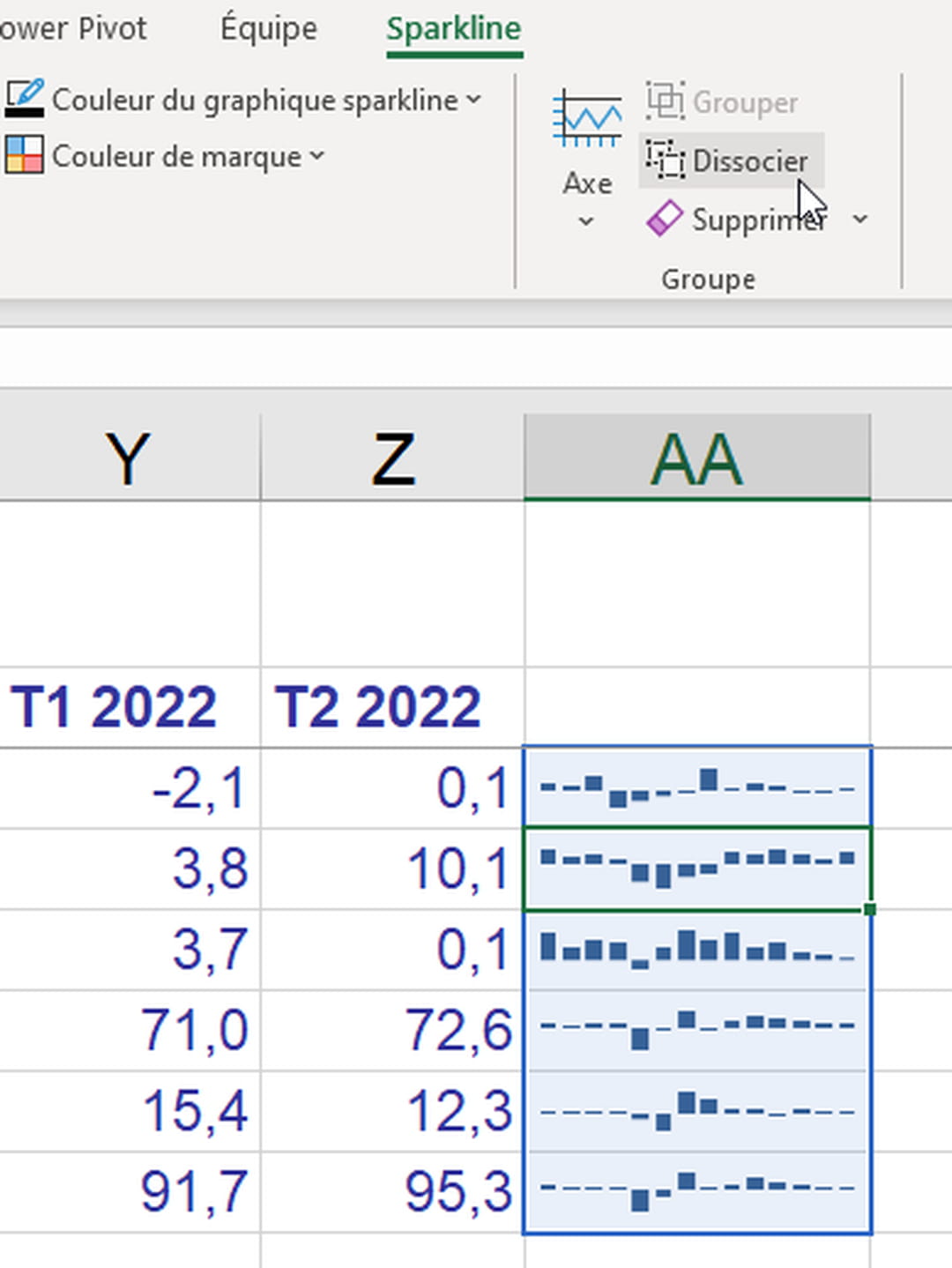
- When cell(s) containing sparklines are selected, a green tab Sparkline is added to the very right of the Excel ribbon. Click this tab to access the mini-charts options.

- When several sparklines are part of the same group (they were created at the same time or by copy-paste), changing the properties of one (the color of the curve, for example) will modify the properties of all the others . Below, we select the graph located in cell N6, but Excel selects the whole series, from N5 to N23, because these graphs are grouped.

- You can Group sparkline graphs or on the contrary the Ungroup to customize them individually.

- Via the tab Spakline > Modify datayou also have the option of Change group data and location or of Edit data for a single sparkline chart.

- In this same menu, the option Hidden and empty cells is interesting: in the dialog box that appears, if you check the box Show data from hidden rows and columns…

… you can then hide the columns of numbers (below, we will hide columns B to M)…

… to keep only the sparkline charts.

- And under the tab Sparklineindicate whether or not you want to differentiate certain salient points: for example the largest value (high point), the values of each element of a curve (Brands), etc.

- Multiple group options Style will help you to change the colors of the curve or the histogram, the colors of the positive, negative, highest, lowest values, etc. The thickness of the curve changes in Sparkline chart color.

- It is also possible to enter a numeric value or text or a formula in a cell containing a sparkline graph… probably to the detriment of readability. You are also free to change the background color of the cell via the tab Home > Fill Color.

- Via the tab Sparkline > Axismultiple options are provided to modify the chart axes.


Magnify a sparkline chart
- To widen a sparkline chart(s), drag the right edge of the column.

- To play on the height of several lines, select these lines with a mouse drag over their number, then drag the lower limit of any line…

- … all other lines adopt the same height.

- It is also possible to Merge a block of cells (below the range N19:O23) to fit a single enlarged sparkline chart inside.

- If you insert an image on the cell(s) of the sparkline graphs, this image necessarily covers the contents of the cells and the graphs, but you can reduce the opacity via the tab Image Format > Transparency.

Delete a Sparkline chart
- To delete a sparkline chart, the key Delete does not work: it deletes any cell content.
- Click on a mini-chart and under the tab Sparklineclick on To delete to clear either the selected chart(s) or all sparklines in a group.

The online spreadsheet Google Sheets also knows how to display a sparkline chart in a cell. You must write a formula in the cell where the chart should appear.
- In the Google Sheets spreadsheet in French, go to a cell and type a formula like:
=SPARKLINE(data; [options])
where data represents the range of cells containing the chart values, and options the optional information to provide (curve or histogram, color, thickness of the curve, etc.). - By default, a black curve is drawn. Below, with the simple formula:
=SPARKLINE(C5:N5)
- Here is another example to display a green colored histogram:
=SPARKLINE(C6:N6;”charttype””column”;”color””green”)
- Refer to this web page for get help on the function SPARKLINE from Google Sheets.
