Arzhur, a fallen knight, is asked by three old women to deliver a princess. What better way to restore its image than to free a damsel locked in a castle with evil looks? What if the story doesn’t really begin until the princess is delivered?
(“The first page” : discover the new comic book meeting of L’Internaute, where authors analyze the first page of their album. Today the first page of the first book).
The tales of Andersen, Grimm and Perrault have laid down many codes of modern fantasy and fantasy writing. But the latter, as timeless as they are in their themes, were written at a very (too) patriarchal time. Hubert (Human skin), a screenwriter committed to diversity, has joined forces with the talented designer Vincent Mallié (The Great Death) to brilliantly revisit classic fairy tales and bring a touch of feminism and modernity. This original and pleasant duo thus develops a complete story in two volumes, scripted by Hubert before his tragic disappearance. In this story, the reader follows Arzhur, the gruff knight-mercenary in search of redemption, and Islen, the exiled princess with mysterious powers.
The first page deciphered with Vincent Mallié

“When we designed the story with Hubert, we imagined this first page to enter the story. But we then added a short prologue to highlight this starting point and set the scene for a tale. classic. When I create a universe for an album, I try first of all to find the key. When I attacked Dark, I began to sketch the decorations and to push my graphic research. I tried quite early to get down to it: between the valiant knight, the castle and the three witches, there are all the elements of a classic fairy tale … But after several sketched sketches, I found myself realized that this board was too big for me to attack with this one. I started with what is simpler: action scenes, or anecdotal scenes. Then I came back to this first page once I was sure I had found the right tone, the right design for our hero, but also the atmosphere I wanted to create. I did not find Arzhur’s final drawing until the 25th drawn plate. It had nothing to do with the beginning of the adventure! It’s a bit like I shot a third of a movie telling myself that he was not the right actor and that I was going to change him. Then, I redo everything or I modify according to the scenes. I cover the whole album in drawing, then I spend a month and a half fine-tuning all the elements. Sometimes I cut out scenes or boxes with a cutter, put them together with tape. Sometimes, for the balance of the album or to mark the importance of a scene, I happen to add a page. “
Attack the board with a very large square:

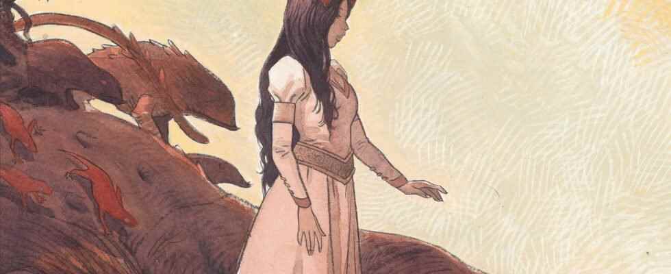
“Each designer has his own way of bringing the emotion and the reader into the story. I really like to attack with an overall shot to situate the scene, like a shot in the theater. The reader must know immediately who is who, where the action takes place, and what the mood is so that I can then get as close as possible to the characters. In general, I start my scenes by setting the decor. is like an opera entrance where you have to put in an imposing element right away. You have to be spectacular from the start – then come back to the characters and something quite intimate. There are only three, four characters lost in a moor, with a threatening castle on the horizon, which makes it possible to elude all the elements of information and to concentrate only on the acting of the actors… before entering the scene.
When Hubert told me about the three witches, I thought to myself that it was something seen and reviewed – but I changed my mind, because there was something special to emerge. These characters in the background are hardly supposed to have any psychological construction, but they play a central role in the lives of Arzhur and Islen. In the second volume, we will discover the past of the fallen knight. The weight of the family is a key to this fantasy tale, both on the side of Islen and Arzhur.
I love to suggest emotion without showing it
The idea, by placing the actors behind them, is to situate the reader as if he were with them. This places him at human height, at the height of the characters. I don’t use a lot of distortions, I like to be in something quite frontal. There is an evidence that emerges in the plan. This helps to show where the characters are going. I like the evocative side that this type of staging develops. By being closer to the actors, as a reader, we project ourselves much more into the expressions and feelings of the latter. I love to suggest emotion without showing it.
If he lingers his gaze on the knight and his squire who have straight backs and the three witches who have hunched backs, the reader is struck by the difference in stature. But that’s not the most important. Here the idea is to have dynamic lines which guide the eye. On this first square, there is an obvious mass ratio: the castle at the back is the main point of the plot; next comes Arzhur on his steed, which dominates everyone. Thus, it is the reader’s first point of contact. If I had wanted witches to attract attention, then I would have positioned them higher up, or forward on the plane, or even on a mound. It is a composition in triangle – or rather in podium: the castle, the knight and his squire and finally the witches. It is an off-center triangle that rebalances the image.
A semi-imaginary castle
When we started working on the album, Hubert had already accumulated a lot of documentation. He sent me tons of castles, in all shapes and sizes: paintings, photos and even hundreds of plans. The aim was to help me with this documentation but there are so many different buildings, eras and structures that I got lost!
I decided to forget a little about the documentation he sent me and I based myself on a castle which is in Poland, I believe. I took a lot of liberties and then I told myself that I was still going to bring an element in the structure to make a castle a bit like Disney: we are in a tale, in something fantasized. The dungeon tower is super imposing for example and gives this magical, very epic rendering of the knight’s tale. It is this kind of element which is essential to set the tone of a work. “

“The second box remains in the register of evocation: the faces and expressions of the characters remain difficult to distinguish. We are on a very intimate stage which increases the expectation before a fight. We can take the opportunity to show the heaviness of the knight dressed in his armor. The armor is a very important imaginary vehicle: by using a breastplate and a coarse chainmail, without embellishment, the reader is indicated that the sequel will be a rough fight and not a fairytale game. was inspired by the armor of the film Excalibur by John Boorman, heavy and almost disproportionate.
The narration is more important than the drawing itself
When I compose my page, the narration is more important than the drawing itself. Decide what to draw or not, what to show, how to guide the reader with the path of the bubbles and the lines of force so that he does not ask himself too many questions. .
Whether it’s the inking, the decor, the lettering, I do everything by hand. It’s really something that I really like. There is a relationship to paper, to the material that I cannot find with digital. The colors are by Bruno Tatti and are produced digitally from scanned analog designs. While discussing with Bruno, we agreed on a simple coloring, without overbidding effects. The place is quite hostile, so we needed rather muted colors for this scene, a sort of Scottish atmosphere.
On this first page, I first positioned my bubbles so that the eye could sweep the castle and then the decor. Then, the eye returns to the characters and the lines of force guide the gaze to the right, the third box and the close-up on the knight. Knight whose gaze points to the fourth and last box, the one that reveals the sword. The latter’s blade comes out of the page, inviting the reader to turn it. “
Dark, Dupuis editions, € 19.95