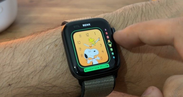
In this video, we take a look at the WatchOS 10 innovations that stand out especially with the Snoopy dial and touch on the prominent features.
As you know, Apple recently shared details about new updates such as iOS 17 and WatchOS 10 in its special presentation. Just after the presentation, beta versions were released as every year. We have been using both versions for over a week. Also in this video What’s new in watchOS 10 We wanted to make a compilation for you.
Featured watchOS 10 innovations
First of all, Apple Watch Series 4 later is required to install the version. Also, you need to have iOS 17 on your phone, you cannot install it without iOS 17.
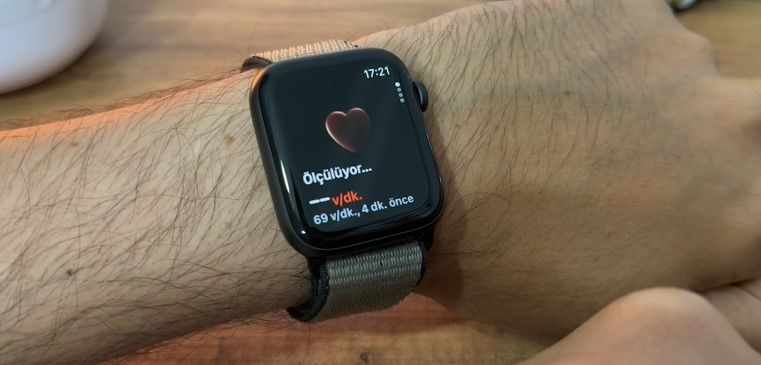
In general, significant changes have been made to the interface of the watch. Mood was added to the awareness part, and a three-dimensional visual was used in the heartbeat. The interface of the now playing section has been greatly changed, and now we can see the album cover on the watch. In the same way, minor changes have been made in almost every application such as noise level, sleep tracking, and sweet touches such as interface transition animations.
While the notification icon is changing, we see that two new dials have been added to the watch. Adding new dials in every update, Apple this time presented Palette and Snoopy dials to its users. The palette dial is actually a beautiful dial that draws attention with its colors and you can customize the notifications and colors on the side.
The main event is on the Snoopy dial. I didn’t like the Mickey dial that came out before, I don’t usually like this kind of dials. But the Snoopy dial is absolutely perfect. It is very pleasant to use with its simple structure and animation quality. This dial, where you can change colors and numbers, greets you with a different Snoopy animation every time it is opened, and all of them are very well thought out.

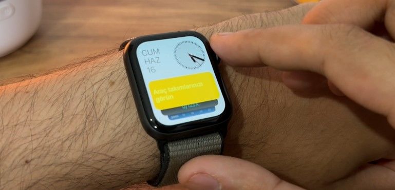
We can no longer change the dials directly by swiping, they are changed by simply holding them down. In the past, when we pulled to the right and left, there was a transition between the existing, loaded dials. Some changes have been made on the user side. When we pull down notifications, when we pull up widgets appear. Likewise, when we turn the dial directly, we come to the widget part. Speaking of widgets, you can delete and add widgets on this screen, just like on the dial, when you press and hold them. You can add up to 8 of them.
The grid view in the application section has been changed. There is no zooming in and out anymore, we can see the same size applications by up and down. Of course, the list view has kept its place. There are some slight overflows here as it is still in beta, but these will be fixed until the full release. It’s also easier to choose between grid and list view without going into settings.

There are also some minor changes to the wheel function. As I said, when you turn it directly up, the widget screen comes up. If you pull down while the application screen is open, you can reach this widget part. The control center, which we used to reach by swiping the screen, is directly assigned to the bottom button. When you press this button once, you reach this menu. If you press it twice, the wallet and payment methods are activated.
See also: Apple Vision Pro
