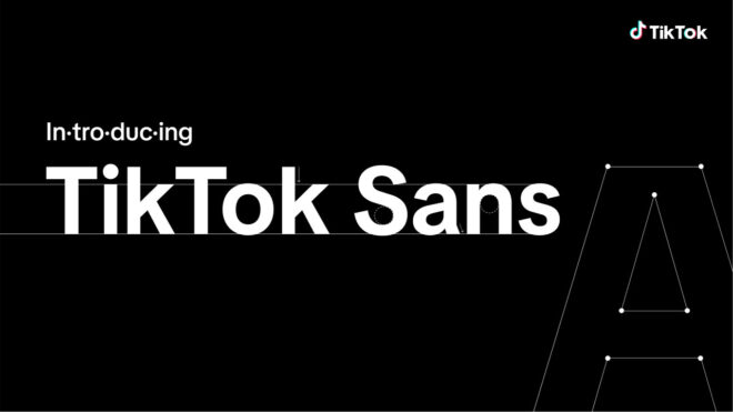
The platform of social media that usually comes to the fore with bans TikTok, introduced the new typeface TikTok Sans.
The official statement from TikTok regarding the new font is as follows: it happened: “Whether in-app or on the web, at TikTok we work to inspire creativity and bring joy. With every new trend discovered, every video shared among friends, or practical knowledge learned, the look and feel of TikTok paves the way for these unique and fun experiences. As we continue to be inspired by the boundless creativity and originality of our global community, we are pleased to introduce our newly designed typeface, TikTok Sans. Designed to reflect our community of content creators, visionaries and storytellers, TikTok Sans complements our platform’s personality, from our entertainment roots to inclusiveness and self-expression. Created in collaboration with Grilli Type, a renowned international design studio, this versatile typeface aims to further develop creativity and original expression. TikTok Sans has been introduced all over the world to provide a convenient and consistent experience across all our channels. TikTok Sans represents our commitment to meaningful innovation as we aim to continuously improve the user experience by providing multilingual font support for our global community, as well as optimizing readability and reading permanence.”
YOU MAY BE INTERESTED
According to TikTok, the most notable improvements in the new font are:
- -Simplified and distinctive fonts: TikTok Sans letters have larger openings and clearer strokes. This makes it much easier to distinguish them from each other. Designed with user interface improvement in mind, the new fonts also feature slick and simpler shapes that provide better recognizability and reliability across languages.
- -Improved readability: Compared to the previous Proxima Nova font, TikTok Sans is visually larger and the overall line height has been increased to improve readability. A special formula has been introduced to improve letter spacing. These minor changes significantly improve readability for users and make the platform experience more fluid.
- -Multi-language support: Representing the diversity of our global community, our new typeface is initially available in English, Spanish, Portuguese, French, German, Italian, Indonesian, Turkish and supports various languages, including Vietnamese. New languages will continue to be added in the future.
The company also conveys the following about the process: “Because we are committed to ensuring the safety and security of our community, we’ve equipped Sans with built-in accessibility and anti-fraud features. To protect our users against username spoofing, we offer stylistic alternatives for fonts, easily confused letters and numbers. It comes with equal-width alternatives, all with the same width, for easier alignment and less distraction in scenarios like numbers, pricing tables, or rapidly changing LIVE reaction numbers. At TikTok, we are committed to responsibly innovating to improve the experience of over 1 billion people around the world who come together on our platform to unleash their creativity, enjoy new discoveries, communicate and feel a sense of belonging. The introduction of TikTok Sans is another milestone in our journey as we continue to build a thriving special place with our global community.”
