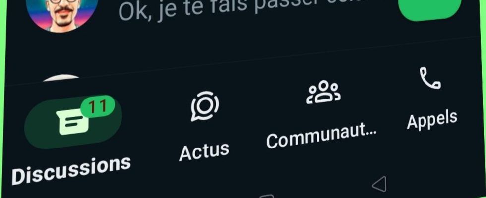
There are changes on WhatsApp! Instant messaging has a whole new face, with a completely modernized and redesigned interface. We will have to adopt new habits!
If you, like two billion users, use WhatsApp, you may have noticed a change the last time you opened the app! Over the years, Meta has mainly focused on adding features, making instant messaging ever more convenient. Sending photos and videos in HD, the appearance of news channels, video messages, the possibility of sharing your screen… The company has pulled out all the stops! But with all these new features, the interface had to follow! Also, the latter has the right to a small facade renovation, for a cleaner and less busy look. A real facelift for messaging, which is modernized by removing the green color from the upper application bar, which is nevertheless characteristic of it.
Indeed, on the Android application, WhatsApp has the right to a new green as the predominant theme color for light and dark modes, as well as a new chat bubble color for the dark theme and the action button floating. On iOS, notification badges and buttons have changed from blue to green. The most important change is certainly on Android, where the horizontal bar of WhatsApp, which is normally located in the green banner at the top of the screen, is now found at the bottom, with the tabs “Discussions”, “News”, ” Communities” and “Calls”. A bit like on iPhone after all!
For its part, the search bar is placed at the top of the screen. Note that the Meta AI chatbot is accessible directly from it – but we cannot yet take advantage of it in France –, with discussion filters just below: “All messages”, “Unread”, “Personal ” and “Business”. This is especially useful when juggling dozens of active conversations.
Some icons and buttons have also changed shape. In addition, WhatsApp wanted to bring more contrast to its different modes. So, “dark mode is even darker to make text easier to read. Likewise, we added more white space to the app in light mode”, says Meta. Finally, the app updated its icons for a more rounded style and added new animations “for a more playful aesthetic”.
Other interface improvements are still under development and can already be seen in the beta version of the application, particularly on the call screen. For example, the “Back” button, which is normally at the top left, should be replaced with a “Collapse” button, so as not to give the impression that we are going to end the call, while the lower bar will have the right to more marked icons.
