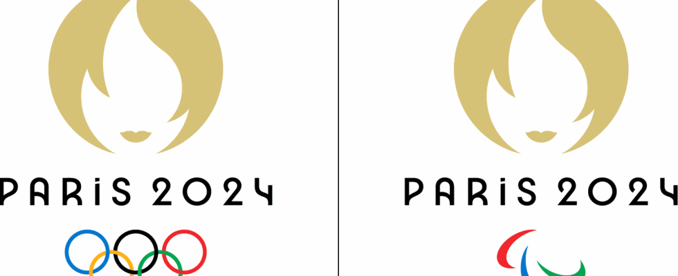
A few months before the Paris 2024 Olympic Games, the logo of the global event is still causing so much talk. And there are many hidden messages.
On July 26, France will launch its Olympic Games by organizing the opening ceremony of the Paris 2024 Games. A global event prepared for several years and highly anticipated. But the Olympic Games are not only about athletes and events, they also carry many symbols, starting with the mascot and the logo.
Unveiled on October 21, 2019 at 8:24 p.m. (8:24 p.m. or 2024, if you understood, well done to you), the Olympic logo is supposed to represent several symbols, mixing references to France and Olympia. Its circular shape and golden color obviously represent the gold medal, the ultimate goal of all Paris 2024 Olympic athletes.
The second symbol, in the center, is more difficult to identify. It is not the Tinder logo, as some may point out on social networks, but the image of the Olympic flame. A flame that will be proudly carried throughout France with an epic journey from Marseille to Paris from May 8 to July 26, 2024.
The last of its symbols is not the most visible either. However, the Olympic logo is supposed to highlight the image of France with its Marianne. Present on a daily basis alongside the French, it embodies the values of the French republican motto “Liberty, Equality, Fraternity” and for foreigners, it can be associated with the symbol of the French spirit and ambition.

As with a riddle, the three symbols form a whole. If you haven’t noticed yet, take a step back and observe… Okay, have you noticed? No, it is not the logo of “Sylvie hair salon”, as social networks may mention or even less a “Karen” (a derogatory way of talking about a middle-aged, classy white woman average person who rebels against everything – Editor’s note), as mentioned a recent New York Post article. It is a face, feminine yes, but which is supposed to highlight the human and popular side of these Olympics.
Tony Estanguet, president of the Organizing Committee for the Olympic and Paralympic Games, explained during his disclosure that “this face embodies our ambition to put people at the heart of the Games with an idea of a Games that are more open, more participatory, more inclusive and where the spectator also becomes an actor.
In detail and for your personal culture, if you have decided to go through with this paper despite the great disappointment of the true identity of this logo, know that the latter has a shape which recalls the geometric spirit of Art Decoration. Its golden color is also a nod to this period. Although it is not unanimous, the Olympic logo also has an “eco” goal through its font in order to limit the use of paper necessary for materials and energy consumption on digital media. As you want more, know that in digital format, colors in dark mode reduce energy consumption when displayed on a computer or smartphone screen… Come on, we’ll stop there.
