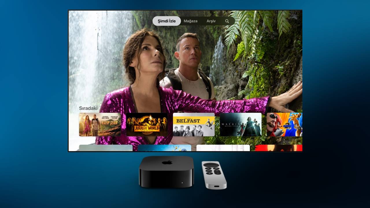
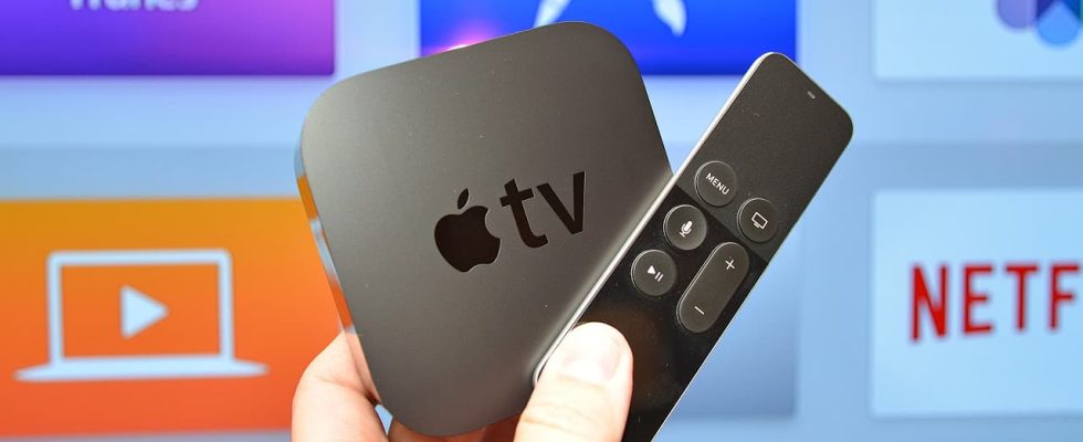
tvOS 17.2 beta included a redesigned Apple TV app that emphasized channels and app navigation. Apple TV hardware runs the Apple TV app, where the Apple TV+ service lives as a channel. Until now, the Apple TV app has been a mix of every piece of content available with minimal sorting options. With tvOS 17.2, users have a brand new Apple TV application design. The primary Apple TV app experience remains mostly unchanged.
Apple TV app redesigned
First, the top tab switcher has been moved to the sidebar where there are more options. The sidebar highlights available content sorted by channels, but Apple TV, MLS, and iTunes content are at the top. Apple lets you hide unwanted channels or apps, but it doesn’t let you hide any of its apps or services. ‘Watch Now’ is still a collection of all enabled content to populate the Apple TV app. The old channels section with circle icons has now become My TV with square icons, and this has been combined with the apps section.

The number of premium channels built into the Apple TV app was so small that users likely had never engaged with them outside of Paramount+. Now apps like Disney+ and Max seem to be a part of the TV app like never before. Netflix is still not part of the Apple TV app or Up Next, and playing a video from an app still launches the dedicated app to play it. But improved navigation of the sidebar and My TV sections makes everything easier to navigate.
