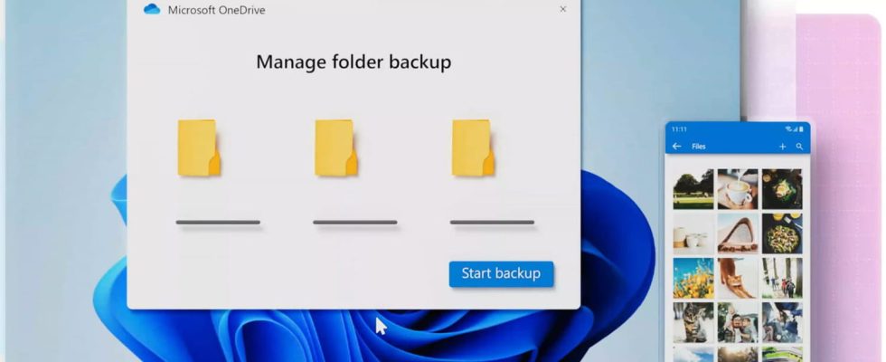
Microsoft’s OneDrive service will undergo a significant overhaul of its interface and benefit from new functions to become even more practical. The update rollout is already underway and is expected to be completed by the end of February.
If Microsoft is struggling a little on the Windows front, with recent updates encountering installation problems or triggering bugs for certain users, the company has however just announced the release of a new version for one of its flagship products, its online file storage and sharing service OneDrive.
All Microsoft account holders, i.e. almost all Windows users, have a OneDrive space where they can upload files and synchronize the content of their different devices (computers, smartphones). The Redmond firm indeed offers a free plan of its service to each personal Microsoft account. This version includes, among other things, 5 GB of online storage, the Outlook mail and calendar service with 15 GB of space, as well as the web versions of Word, Excel and PowerPoint. A great set of tools that everyone can benefit from for free, on Windows, macOS, Android and iOS, as long as they have a Microsoft account.
Good news, the firm has just announced the start of the deployment of the new version of OneDrive, which brings “an improvement both visual and functional“service and promises to return it”faster and more intuitive than ever before“.
New OneDrive: a modernized and refined interface
The first change to OneDrive is visual and aesthetic. The current user interface of the service is indeed somewhat busy and messy, making navigation a little laborious. The new version currently being deployed will therefore make everything more user-friendly and readable, with a refined and standardized interface. The colored title bar, somewhat inelegant and dated, gives way to a more modern, uniform window.
The options New And Load are merged into a single button, moved to the side panel on the left, which now groups together in the same place the actions of creating a document or a folder, and loading of files from your device.
These changes, minor at first glance, bring a welcome refresh to the application and bring it more in line with current design standards. The developers also announce that these graphical changes are “consistent across the entire application, providing a seamless and seamless experience“, which is to be welcomed given Microsoft’s propensity to leave bits of old interfaces lying around all over Windows.
OneDrive 2024: improved functions for finding files
In terms of functional improvements, two interesting new features have appeared and should allow more fluid and intuitive exploration of the content of your OneDrive.
First of all, a new presentation of files by “Person” is introduced. This view allows you to sort and filter the files displayed according to who sent or modified them. A particularly practical function given that OneDrive is above all a storage and sharing space for collaborative work on documents.
Finally, it is now possible to filter the contents of a folder by file type. When the contents of a directory are displayed, buttons corresponding to the different file formats detected appear above the list of documents in the folder, and allow you to filter the display with a simple click.
Microsoft announces that the deployment of the update has already started and will be completed for all users at the end of February 2024. If this new version is not revolutionary, it constitutes a smooth and include useful improvements that should make OneDrive even more pleasant and practical to use on a daily basis, whether in a personal or professional context.


