
It’s a new year and a new look for London’s heavily used public library system.
It’s a new year and a new look for London’s heavily used public library system.
London Public Library’s roughly 180,000 users will see some big changes this year, starting with a new digital logo in upbeat colors of navy and yellow and sporting energetic illustrations, said Ellen Hobin, manager of communications.
Launched in 2007 the old logo was “difficult to see and use digitally and on signs,” she said.
“We wanted to do something simple, approachable, friendly and wasn’t too pristine or formal,” she said. “What we we’re hoping for is that our users read it, it’s clear and makes them feel good.”
But that is just the beginning for London Public Library as it prepares to launch a new website, library catalog and program registration platform over the next few months with the intention of making the process easier for London readers.
It is the library’s first investment in an updated website in 10 years. The cost of the improved website will weigh in at $250,000, Hobin said.
“The important thing about our website is that it will be a new catalog — the part you go to find and borrow books,’ she said. “The goal for the website is that it is easier for people to find things and to know what the library has.”
Michael Ciccone, CEO of the London libraries, said: “What we wanted reflected is what a library is now.”
Libraries have changed over the last 20 years from staunch institutions to being “much more of a community,” he said.
“Our spaces are very open, we don’t shush anybody anymore. I think that new logo and brand reflects that. We’re thrilled with it.”
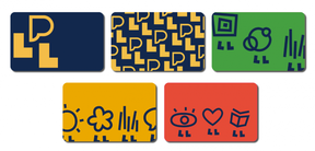
The makeover also includes new library cards — there are five designs to choose from — which library users can have replaced if they wish at any London library branch, Hobin said.
The logo has been “soft-launched,” she said, being attached only to vehicles that needed to be replaced in order to save money.
It can also be spotted on posters promoting library events and exterior library signs as they need to be replaced.
“Because we were updating a number of things at one time, that made sense in terms of timing to update the visual look of the library at the same time. Our current look is out of date,” she said. “We knew we needed to have a new logo and colors and fonts that worked better digitally.”
Hobin said the library estimates more than half of Londoners use the city’s public libraries, with one family often using a single card to borrow materials.
ABOUT THE LOGO
- The P is the public, and could be seen as a thought or speech bubble, expressing openness and showing that the library is a place for everyone and a place for ideas.
- The Ls are the libraries that anchor, walk with and lift up the community.
- The font or text is simple, clear and in upper and lower case so that it is easy to read.
Source: London Public Library