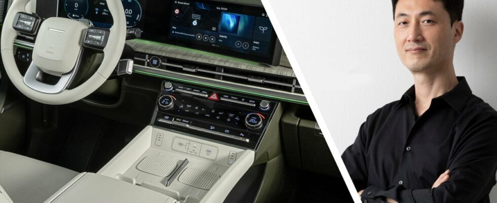
At an early stage, Hyundai appreciated the touch screens offered by, for example, Tesla.
But with the help of focus groups, it was quickly concluded that physical buttons are preferable.
DON’T MISS IT
Our podcast about cars – Under the Hood
Four ways to drive in a roundabout – how do you do it?
Here are Donald Trump’s cars: From Tesla to Lamborghini
A matter of user experience
A Korean executive told reporters during an event at the brand’s design studio in California that they initially tried to switch to a single large touchscreen to control all functions.
However, it quickly turned out that consumers prefer physical buttons and controls, something we can sign off on.
The reason is simple: Touch screens require more attention, not least when certain functions are hidden in a submenu.
DON’T MISS IT
Only available as a diesel: That’s how good the new Audi A5 Avant is
We drive on a volcano: That’s how good the new Lexus NX Overtrail is
Creates frustration
-When we added integrated screens to our vehicles, we also tried touch-based controls, and people didn’t prefer it, Hyundai design director Ha Hak-soo told me.
– When we tested it with our focus group, we realized that people became stressed, irritated and frustrated when they want to do something quickly but can’t, he continues.
Several slopes
Hyundai is not alone in having been inspired by, for example, Tesla, but the novelty seems to disappear for those kinds of solutions.
Some return to more physical solutions, for example Volkswagen.
The brand that Aston Martin means has lost the customer and ruined the experience as soon as you are forced to use a screen to, for example, adjust the temperature in the car.
