Google continues to modernize the Maps interface. The mapping and navigation app has received several discreet but welcome improvements, particularly in terms of route search, for a more airy rendering.
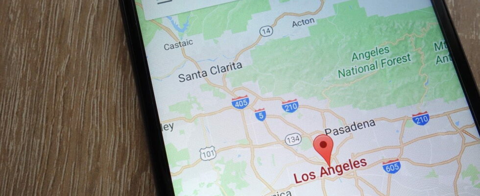
For many of us, Google Maps has become a faithful companion when traveling, but also in our daily lives. Whether it’s to get to an appointment, check the travel time or simply find a nice little restaurant to have lunch at, the mapping service from the Mountain View firm is still there, faithful to its post. Also, small changes often have a big impact on its users. Google has been making efforts to rework its interface lately, including adopting new colors for its maps – which is far from pleasing everyone –, adding a 3D view during navigation and improving the recommendation system (see our article). But the Internet giant is not stopping there and, as reported 9to5googleit has just deployed a global update that brings some changes, including at the level of the route search, even if they are not the most obvious. Modifications already tested in February and then last May, and which are finally deployed to the general public.
New Google Maps interface: lighter and more intuitive
First, if you tap on a place, a new card appears with close and share buttons in the upper right corner – a minor addition that could almost go unnoticed. Its edges are more rounded, with a small overprint effect, and the map remains visible in the background. The place cards are therefore no longer displayed in full screen, which reinforces this “card” aspect, making navigation more pleasant and more intuitive. In addition, it is easier to close these windows thanks to an X button on the right.

The most important change in Google Maps concerns the route search. The interface for entering the departure and arrival addresses no longer extends over the entire upper part of the screen, but takes the form of a pop-up window, overprinted, with rounded edges. Here again, this lightens the rendering and reinforces the cartographic side of the application. In addition, if the initial interface for entering the destination, with the transport selector and the list of recent places, is unchanged and remains a full-screen page, the top of the screen now only displays the departure and arrival location once the destination is entered. The way to change mode has been moved to the bottom for better accessibility, in the form of a carousel. Simply deploy the overprinted card to deploy upwards.


All these changes bring a more than welcome touch of modernity and make navigation a little easier. The redesign is now available on the stable version 11.136.x for Android of Google Maps. On the other hand, nothing on the iOS side for the moment.