
Google continues to modernize the Maps interface. The cartography and navigation app is entitled to several discreet improvements but welcome at the level of the overviews, which becomes more readable.
For many of us, Google Maps has become a Faithful traveling companion, but also on a daily basis. Whether it’s joining an appointment, estimating a journey time or finding a good restaurant, the Mountain View mapping tool is always present. This is why each small evolution can have a notable impact on its users. Google regularly strives to improve the interface of its application, even if the changes are sometimes subtle. This time, the company simplifies the overview of journeys in the Android version of the mobile application, as noted our colleagues as 9TO5GOOGLE. This becomes more readable, less busy, in order to enhance different information, such as travel time, planned arrival, tolls or even savings made.
Google Maps journeys: a light but practical change
Previously, the overview of the journeys in Google Maps consisted of three small lines which left a large empty space on the right part of the pop-up window. From now on, the duration of the journey is displayed on two lines, much larger and visible, which then occupy all the space. By playing on the colors of the police and the bold, the interface offers a quick reading, allowing to know at a stroke ofeye Distance, possible toll costs or time saving. A mention “Arrival at HH: MM” also appears, which is very practical. This new display is valid for all modes of transport.
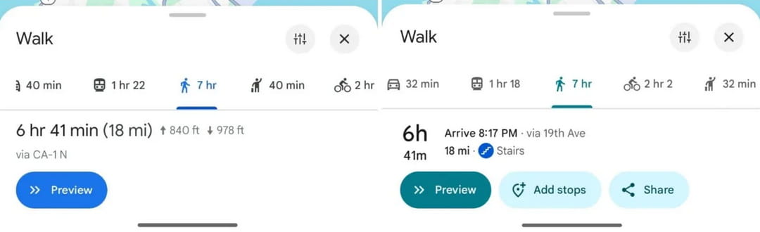
In addition to that, the new interface offers several buttons to quickly add a stop, save the route, share it, etc. Finally, we notice a slight change in the tone of blue, which turns more on duck blue-that will cause stir-house, when we remember the dissatisfaction that the latest colors have caused! These changes are being deployed through version 25.13.06 of the application on Android – on our side, we have indeed been able to see the color change and the new buttons, but not the new display of information, which should not be long. However, there are no news on the side of iOS.