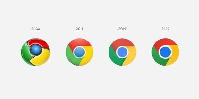
The Google Chrome browser was first released in 2008. Google Chrome’s logo at that time consisted of a blue circle surrounded by three slices of green, yellow and red. Since 2008 the logo had undergone minor changes. However, despite the changes, the Google Chrome logo remained the same when we looked at it from a wide frame. Today, when material-designed logos have turned into a trend, it has been revealed that Google has made a new change in the logo of the Chrome browser.
THIS IS WHAT THE NEW GOOGLE CHROME LOGO LOOKS LIKE
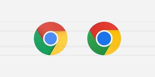
Google Chrome designer Elvin Hu published the new Google Chrome logo on his Twitter account. “We updated Chrome’s logo for the first time in 8 years,” said Hu, adding that the new logo will soon begin to appear on devices. So how does the new Google Chrome logo look?
In the new logo of Google Chrome, the shadows are removed and the colors are made brighter. This simplifies the logo. Although not mentioned by Hu, the blue circle in the middle looks larger. The colors in the logo are more vivid.

Discovering that juxtaposing certain shades of green and red creates an unpleasant color vibration, the Google team made a very subtle addition to the logo to reduce this. But in general, we cannot say that there are very big changes.
THE CHROME LOGO WILL NOT LOOK THE SAME ON ALL SYSTEMS
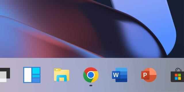
The ChromeOS version of the Chrome logo will appear more colorful to match other system icons, while on macOS the logo will have a small shadow. Windows 10 and 11 versions will be prepared to match the style of Windows icons.

Hu stated that those who use Chrome Canary (the developer version of Chrome) will begin to see the new logo, and that everyone will be able to see the new logo in the next few months.
