You will also be interested
[EN VIDÉO] The Incredible Journey of Global Internet Traffic When we connect to the Internet, our data travels a very long way. An email thus travels an average of 15,000 km to reach its destination!
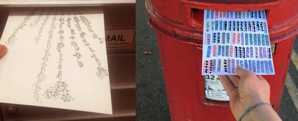
One is English, the other American. Artists both with radically different paths and yet united by two passions, graphic design and data analysis. From these common traits was born a slightly crazy project: Dear Data. They sent each other a postcard per week for a year. That is a total of 104 works sent over the Atlantic, on the front of which was a hand-drawn illustration and on the back, information enabling the computer graphics to be deciphered.
” Over the fifty-two weeks, collecting data about our lives has become something of a ritual. We would spend the week noticing and jotting down our activities or thoughts, before translating that information into a hand-drawn visualization “, explain Giorgia Lupi and Stefanie Posavec.
New visual models
The ambition was twofold: to explore all the capabilities of data visualization to get to know themselves better from recurring events in their lives and to evolve as designers by inventing new visual models. Some cards also required more than seven hours of work.
Number of “thanks” received, laughs, times they looked at the time or the variety of perfumes they smelled… so many subjects that allow them to underline ” the profoundly human philosophy of the project consisting in recovering the texture living data in our daily life from the insensitive, algorithmic and non-human connotations of the word “.
The Dear Data project brought together two designers, Giorgia and Stafanie, who sent postcards to each other to make a data visualization. © Somerset House, Dear Data
A real enthusiasm
The originality of the project lies both in the subjects treated, impersonal data instead of cold data, and in the graphic processing, visual arts instead of the traditional digital arts, only on the support, the long time of the postcard versus the speed of the Internet, but above all on the purpose, to get to know each other better and, in the end, to connect, but not necessarily in the digital sense of the term…
A success that has generated real enthusiasm around the Dear Data’s Twitter account inspiring many people to contribute with freehand infographics. The postcards were also displayed during the event big Bang Data at Sommerset House, London, and have been published in a book by Penguin Books.
Strategic decision support
Dear Data is also an argument, certainly offbeat but no less impressive, in favor of the power of data visualization. At the time when the volume available data is on the rise and we are beginning to understand what is at stake, it is important to be able to make them visible, understandable, impactful and attractive. Especially since the brain processes visual data 60,000 times faster than text, and assimilates it better.
In fact, in a study conducted by Tableau Software and YouGov, data is a source of innovation and growth for 87% of the decision-makers surveyed who consider that sharing data in a simple and visual way makes it possible to detect opportunities. On the other hand, 34% of them believe that their company does not make the most of its data due to a lack of skills, appropriate tools and personnel.
The need for training
It is therefore the whole art of data visualization, which needs real experts both in data processing and analysis, but also in storytelling and its graphic presentation in order to make it a real tool for ‘help with the decision. Not everyone can improvise in the discipline, as evidenced by This site which compiles the worst examples.
Training, such as that offered by DataScientestalso moves the lines between the technical and functional professions with a hybridization skills at the crossroads of computing, statistics, communication and art. They even allow some to be able to master languages such as Python which has established itself as a free and open-source language to use for analyzing datasets.
Article produced in partnership with DataScientest
Interested in what you just read?