CORONAVIRUS CARD. Number of cases, incidence rate, hospitalized patients, patients in intensive care… Where is the Covid-19 epidemic near you? Here are our coronavirus tracking maps by city and department.
In this article, we present several daily situation maps of Covid-19 in France, bringing together some of the main indicators, department by department, but also city by city. These Covid maps include the latest figures available for hospitalizations, intensive care cases, deaths, recoveries, but also the key indicators such as the test positivity rate, the incidence rate, the effective R or the rate resuscitation bed occupancy.
We display below a first map with a departmental division. It is followed by a map giving access to key data in the 36,000 municipalities of France and a third on more detailed data for the 22 major cities. These maps are updated between 8 p.m. and midnight each day, with the latest data available. To fully understand the colors and numbers presented, read the details below.
This coronavirus map of France is the result of data updated daily by Public Health France and the Data.gouv.fr site. It is colored according to the last incidence rate measured over a sliding week in each department. A series of key data on the epidemic is mentioned over each area, such as the test positivity rate, the incidence rate or hospitalized patients.
Since mid-October 2020, Public Health France has been communicating incidence data (number of cases per 100,000 inhabitants) at municipal level. The figures are at this stage communicated according to a scale (10, 20, 50, 150, 250, 500, 1000 cases per 100,000 inhabitants). The data is expressed over a rolling week, which means that it is calculated on a D-day from tests carried out between 3 and 9 days previously. Click on a department to find a municipality.
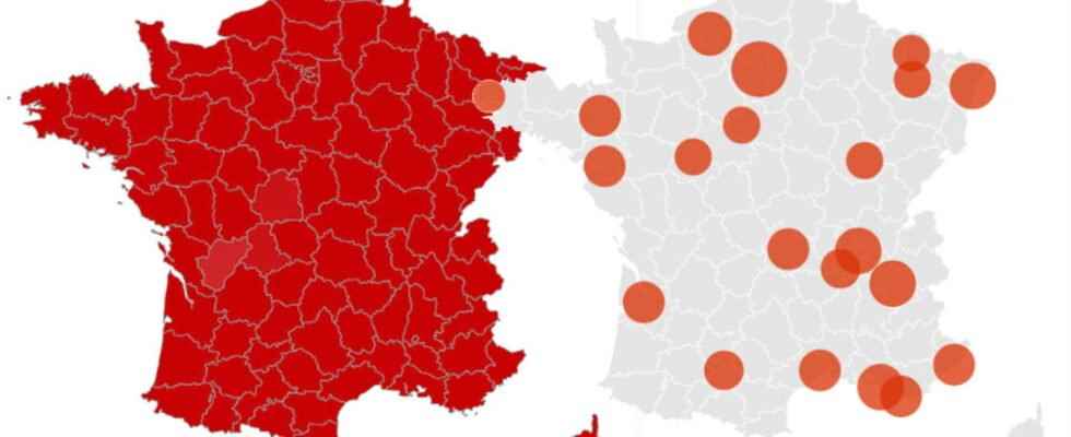
Paris, Aix-Marseille, Lyon, Toulouse, Lille, Nice, Montpellier… The map presented below provides more detailed data on the exact incidence rate as well as the incidence rate for people over 65 in the 22 French metropolises, corresponding to the largest cities and their agglomerations. These figures are also expressed over a rolling week, which means that they are calculated on a D-day from tests carried out between 3 and 9 days previously.
We have tried to produce at the top of this page a cartographic summary of the main indicators of the coronavirus in France. These indicators can still be refined and many other data on the virus are available on the Geodes portal, from Public Health France. In particular, departmental, regional and sometimes even municipal maps are made available on the number of positive tests, the rate of positivity of the tests or on the incidence rate already mentioned above. Each of these maps can be refined by age group or gender. Here is a list of the main cards available:
- Number of positive people per department: see map
- Number of people tested by department: see map
- PCR test positivity rate by department: see the map
- PCR test positivity rate by municipality: see the map
- Incidence rate by department: see the map
- Incidence rate (scale) by municipality: see the map
- Incidence rate (exact) in the 22 metropolises: see the map
- Effective R (virus reproduction rate) by region: see the map
Read also
The maps linked to the tests, the incidence or even the reproduction rate of the virus (above) are the first indicators of the circulation of the coronavirus at the territorial level. Maps relating to the acts of SOS Médecins or visits to the emergency room are relevant indicators in a second phase, when the progression of the epidemic results in the use of medical services. Ultimately, it is the evolution of the number of hospitalizations or cases in intensive care that will confirm to what extent the coronavirus circulates in a given territory. Here are the main hospital data maps available on the Geodes portal:
- Rate of daily SOS doctors’ acts for suspected Covid: see the map
- Rate of daily emergency visits for suspected Covid: see the map
- Daily new hospital admissions: see the map
- Number of people currently hospitalized: see the map
- New daily admissions to intensive care for Covid: see the map
- Number of people currently in intensive care: see the map
Finally, Géodes makes it possible to observe mortality data linked to the coronavirus in France, by department and by region. Other cards are also available concerning discharges from the hospital (or “returns home”) which can be assimilated to cures:
- Number of Covid-19 deaths since March 1: see map
- Number of returns home since March 1: see map
- Complete dashboard established by Esri France: see the map
Understand the numbers
Our first Covid-19 map shows the latest hospital data (hospitalizations, cases in intensive care, deaths, hospital discharges) generally reported around 7 p.m. each day. We also display two key indicators of the progression of the virus on the territory: the test positivity rate and the incidence rate. These two indicators, consolidated over a rolling week, are also updated every evening, but with data generally dating back three days. Finally, we also display an evaluation of the “effective R”, in other words the number of reproduction of the virus and the filling rate of intensive care beds by region. These numbers are updated more randomly. Here is a definition of each indicator:
- Hospitalizations: number of hospitalizations in progress on the date indicated (figure in parentheses: new admissions in 24 hours). Public Health France specifies that these figures take into account patients admitted to hospital “with” Covid-19 and not “for” Covid-19. They can therefore take into account patients hospitalized for another reason and positive for Covid.
- Patients in intensive care: number of patients in intensive care units (SR), intensive care units (IS) and continuous monitoring units (USC) on the date indicated (figure in parentheses: new admissions in 24 hours).
- Total deaths: total number of deaths from Covid-19 in the department since the start of the epidemic (figure in brackets: new deaths in 24 hours).
- Discharges from hospital: total number of discharges in the department since the start of the epidemic (figure in parentheses: new discharges in 24 hours).
- Test positivity rate: share of new cases of coronavirus diagnosed by PCR test out of the total number of tests carried out in the department over a rolling week, in percent (figure in brackets: change in the indicator in points compared to the previous measurement). The alert threshold was set at 10%. The test positivity rate since December 8, 2020 takes into account a much larger number of tests carried out. Whereas previously a person who tested negative several times in a row within 60 days was only counted as negative once (it was only in the event of a positive test that his situation changed), these are now all its tests which are taken into account. Public Health France justified this change in a press release.
- Incidence rate: number of new cases of coronavirus diagnosed by PCR test occurring over a rolling week. This figure is related to the number of inhabitants, i.e. a number of cases per 100,000 inhabitants (figure in parentheses: change in the indicator in points compared to the previous measurement). The alert threshold has been set at 50 per 100,000 inhabitants. Since December 8, 2020, the calculation of the incidence rate has taken antigenic tests into account.
- R effective (regional): reproduction number of the virus in the region, in other words the average number of people infected by a patient. If this figure is greater than 1, it means that a person with Covid-19 infects more than one other person on average currently and therefore that the disease is progressing. This figure is only updated randomly.
- Occupancy rate of intensive care beds (regional): share of intensive care beds occupied by patients with Covid-19 in the region, in percent. This figure is only updated randomly.