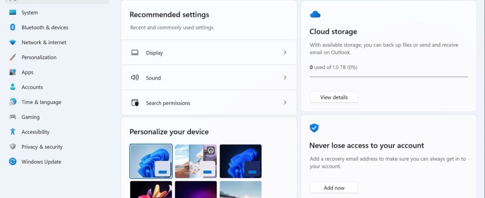
Microsoft wants to simplify the management of settings in Windows 11 through a new home page giving direct access to common settings. A good intention, but we would prefer a complete and coherent overhaul.
Will we finally be entitled to better management of the countless Windows settings? One would be tempted to believe it announcement of a novelty that Microsoft will introduce in Windows 11, and that some users can already test via the latest version (Build 22631.2262) which has just been released within the beta channel of the Windows Insider program. In fact, the Parameters window will be enriched with a new tab – called Home in the Anglo-Saxon version and probably Accueil in French – which will be displayed by default as soon as it is opened and which will give direct access to important and common settings. A good idea, in principle, since it will no longer be necessary to browse the options of the left pane and the associated sub-sections to find an essential setting to modify quickly.
In practice, this Home section will be placed above System in the side pane. And its page will present only a handful of parameters in the form of synthetic “interactive maps”. Small modules that summarize the main information on key elements of the system by offering quick access to the associated settings. On his blog post, Microsoft does not say anything specific about the choice of these cards, but from the first images shared, we see that we will be able to access the most frequently used parameters (display and sound, for example), which should depend on habits of each user, as well as the personalization settings of their Bluetooth devices. But Microsoft also seems to favor its own services by highlighting online storage on OneDrive, Microsoft accounts as well as subscriptions to its Microsoft 365 office suite and its Xbox platform. A way to encourage ever more use of its ecosystem – you are never better served than by yourself… – which will probably not please everyone.
Windows 11 settings: when will there be real simplification?
Because if we can appreciate this process of simplification, which starts from a good intention, we can wonder about the latitude that Microsoft will leave to users to personalize this Home section and the cards it contains, the ideal being that everyone can choose modules adapted to their particular needs. Above all, Microsoft still does not seem to be moving forward on the real in-depth overhaul of the settings that many have been waiting for ages. As we have already lamented on several occasions (see our article on Windows updates), it is high time that the publisher cleaned up the system settings, getting rid of old modules – such as the old Control Panel, inherited from previous versions – and by bringing together all the parameters under a coherent interface instead of continuing to multiply them by scattering them. Why not take inspiration from what we find in macOS or Linux, systems that have been able to bring their settings together in a more logical way? The model doesn’t matter, as long as we achieve the simplification that all users hope for.
It is not yet known when Microsoft will release a final version of Windows 11 with this new settings page. Maybe during a small monthly “quality update”, in September or October. Or with the “big” revision 23H2, which should combine many new features by the end of the year. On the other hand, and this is really good news, the publisher should take the opportunity to deploy Windows Backup, a new application presented in the spring of 2023 which should considerably facilitate the backup of personal data but also their “transplantation” on a new PC. (see our article). A “magical” tool that should really make life easier for users if it keeps all its promises.

