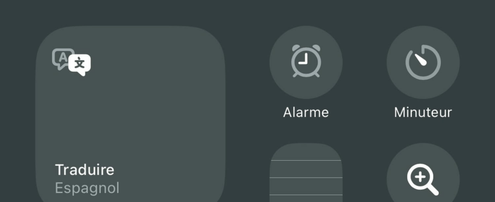
With version 18 of iOS, you can now personalize your iPhone’s Control Center by changing the location and even the size of elements, without needing to go to Settings. Here’s how to do it.
The iPhone Control Center is not new since it appeared with iOS 7 in 2013. It has since undergone several essentially aesthetic modifications while retaining the same objective of providing quick access to a set of functions and features. iPhone settings without having to launch an application or, precisely, the iPhone or iPad Settings (read our article).
But a new step has been taken with iOS 18 (available since September 16, 2024) since Apple has given the Control Center numerous customization options, largely inspired by those now also offered for the home screen icons ( read our article) and widgets (read our article). You can directly modify the size of an element, move it without having to go to Settings and even create several panels within the Control Center. The progress is undeniable even if it makes the Control Center a little more complex to use. Here’s how to master it.
Remember that the Control Center is accessible at any time, regardless of the application you are using. Only the access method changes, depending on the type of iPhone you have.
- On an iPhone equipped with a Touch ID fingerprint sensor, you must slide your finger upwards from the bottom of the screen, for example at the Touch ID button.
- On a more recent iPhone, without a Touch ID button and therefore equipped with a Face ID facial recognition sensor, you must instead slide your finger down from the upper right corner of the screen.
In both cases you will see the control center buttons appear. If you haven’t changed anything yet, you will find the default elements there such as the Connectivity block at the top right which allows you to activate Airplane mode for example.
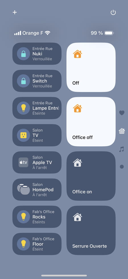
Also note the first new feature in the iOS 18 Control Center: it now offers several panels, each indicated by small symbols in the right margin: the heart for the first page, the house for home automation controls for connected objects and the music notes for the panel displaying what you are currently listening to. You move from one panel to another with a vertical swipe of your finger or a tap on the symbols in the margin. Depending on needs, it is possible to add or remove a panel, for example the one linked to the Home application when you are not using connected objects at home.
iOS 18 Control Center: How to move or delete an item?
Bring up Control Center as shown above and enter editing mode. To do this, you can:
- Perform a long press on an empty area
- Or just press the little sign “+” located in the upper right corner.
Without waiting, a gently flashing frame surrounds each element, and small circles appear to show you the available locations. Moving a Control Center item is done in the same way as for the Home screen icons. When you place your finger on one of them, it expands slightly under your finger, which you can now drag to the desired location.
Also like on the home screen, the elements of the Control Center automatically move to make room for the one you hold at your fingertip. And as with the new iOS 18 home screen, you can also place the Control Center commands on any of the free locations (the small circles).
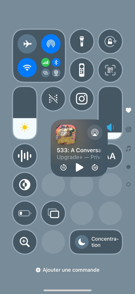
You’ve probably noticed the little black and white “no entry” symbol that appears at the top right of each Control Center item when you enter edit mode: tap the symbol and you’ll make said item disappear. Please note, there is no confirmation: the element is immediately deleted.
iOS 18 Control Center: How to add an item?
Once you have put Control Center into edit mode as shown above, note the line Add an order which appears at the bottom of the screen. Tap it. A large panel slides down from the bottom of the screen to show you all the available Control Center items…and there are a lot of them! So much so that a search box is displayed at the top of the panel.
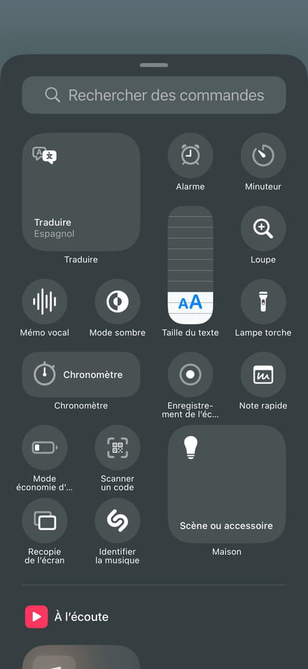
But you can also scroll through the control panel to discover all the elements, classified by category:
- Top most often used
- Then Listening for the Music element
- Capture brings together everything that allows you to capture an image
- Connectivitya little further down, brings together the Airplane Mode, Bluetooth, etc. controls. Note that iOS 18.1 will add Wi-Fi control.
- A little more abs still we find all the controlsVisual, hearing and motor accessibility.
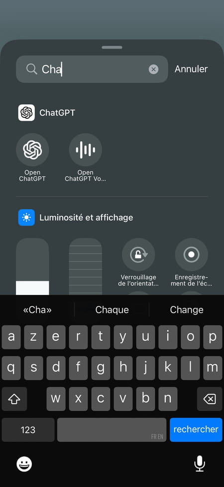
And you will also notice that some commands are linked to the applications you have installed. This is the case for Instagram, for example, whose Control Center command allows you to launch the application, as if you were pressing the icon on the home screen. So reserved for social network addicts… Perhaps more interesting, certain automotive applications allow you to add the command to open or lock your car directly, therefore, in the Control Center. It’s up to you to browse all the available commands.
When you find a command that interests you, it only takes one tap to add it to the Control Center. You immediately exit the Add Commands panel and find yourself in the Control Center.
iOS 18 Control Center: how to modify an element?
In addition to the flashing frame that surrounds each element when you enter Control Center editing mode, there is also an input handle at the bottom right. Place your finger on it and slide outwards: you will see that the control concerned expands to become a larger or smaller widget, depending on the size(s) available.
- In most cases, this only provides a larger button to more easily launch a specific function, such as launching power saving mode if you want to extend the battery life of your iPhone a little at the end of its life. day, flashlight, magnifying glass, etc.
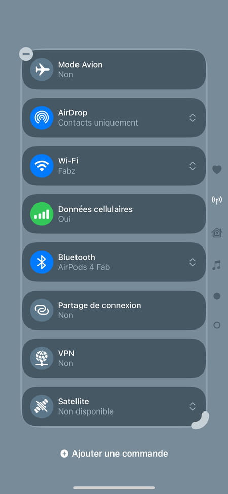
- But in other, slightly rarer cases, this allows a larger number of orders to be displayed. For example, if you expand the box of connectivity commands, the one that includes switching to Airplane mode, then it turns into a long list including all the connectivity commands.
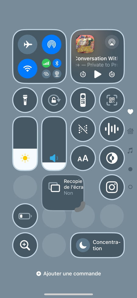
In doing so, we come across one of the sometimes annoying points of the new customization functions of the Control Center. As with those that are added to the iPhone’s home screen, the Control Center widgets have variable sizes but are not completely free: their size is counted in the number of locations represented by the translucent circles that seen in edit mode. And when we enlarge one of the commands to go from a single location to four for example, the other commands push themselves to make room: and if there is no space, some of the commands disappear to another to be added to another Control Center panel.
The problem is that if you change your mind, the orders placed in the next panel do not return to their previous place. They must then be moved one by one by hand and this is a delicate operation.
iOS 18 Control Center: How to add a control panel?
Obviously, if you have read the previous section, you have already understood that to create an additional Control Center control panel, simply drag one of the elements to the lower edge of the screen. Let’s go back in detail.
- Switch Control Center to edit mode by long-pressing an empty area or tapping the sign “+” in the top left corner.
- Enter one of the commands by placing your finger on it: its icon enlarges slightly.
- Drag the item with your fingertip to the bottom edge of the screen
- A new, empty Control Center panel slides up and you can place the item anywhere you want just by lifting your finger.

- Be careful, if you stay at the bottom of the screen for too long, you will create the new panel after all those that already exist: you can easily be surprised. Remember one thing: until you lift your finger from the screen, you are still in control. Which means if you’ve gone too far down, simply drag the finger holding the item back to the top of the screen to put it back in the right place.
- Don’t worry, though: if you’ve left your finger in the wrong place, you just have to, for example, move the element again or simply delete it to add it again… in the right place this time.
Let’s not shy away from our pleasure: the new customization functions of the Control Center are welcome and really allow us to create the one that suits us. We sometimes let ourselves be surprised by the way elements move, but let’s face it, once we’ve found the right configuration for our own Control Center, we almost never change it again, right?
