Snapchat is getting a complete overhaul of its interface that promises to be simpler and more user-friendly, with fewer tabs. We’ll have to wait for users to decide if it’s a success.
A true cross between a social network and an instant messenger, Snapchat is very popular with young people, thanks to its fun side, its many visual effects and its ephemeral messages, which only last about ten seconds – after which they are irremediably destroyed. Although the application has been enriched over the years, it has nevertheless retained its particularity: photos and videos automatically disappear after a few hours. A way of remaining in the spontaneity and immediacy of exchanges, which guarantees its success.
Snapchat is about to take a step forward, however, as its entire interface will be revised with a view to simplifying it. This is the biggest overhaul of the social network in years. This new design, called “Simple Snapchat,” was announced last Tuesday on stage at Snap’s annual partner summit in Los Angeles. “It brings Stories closer to conversations, simplifies content discovery, and brings people directly in front of our camera to express themselves.”said Evan Spiegel, the company’s CEO, The VergeIt must be said that Snapchat has a reputation for being a complex application to get to grips with, both in the distribution of information and the general handling of the interface.
Simple WhatsApp: a simplified interface
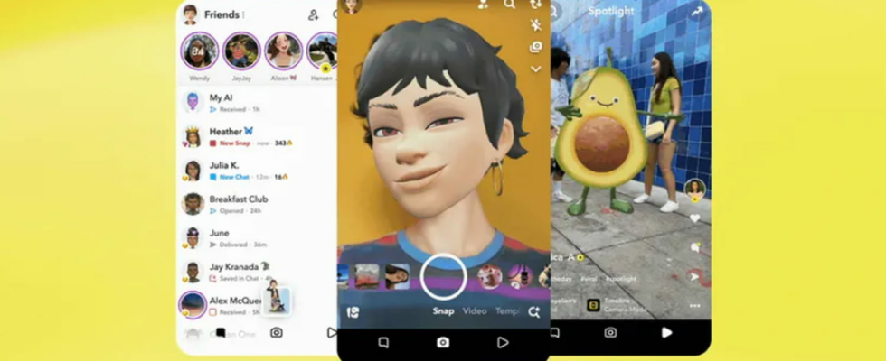
The biggest change is undoubtedly the move from five to three tabs. Until now, Snapchat had five main tabs: one for the Snap Map, one for private chats, one for the camera, one for Stories, and one for Spotlight, its competitor to TikTok and Instagram Reels. The new interface now has only three tabs. The first is reserved for messages and Stories from friends, the second gives access to the camera, and the third, called “For You”, groups together full-screen videos from publishers and creators. The Snap Map has moved to the first tab, messaging, and Spotlight to “For You.” The camera remains the default view when opening the app.
But the goal of this redesign isn’t just to simplify the app. Indeed, the company makes most of its revenue from the ads it serves around content generated by publishers and creators. But the “For You” tab is the result of Spotlight merging with content from media brands like TThe Wall Street Journal and the Daily Mail. In this way, the contents are more highlighted in order to encourage users to spend more time on the application.
The new interface will be rolled out slowly, in order to take the temperature of users and make sure that everyone likes it.