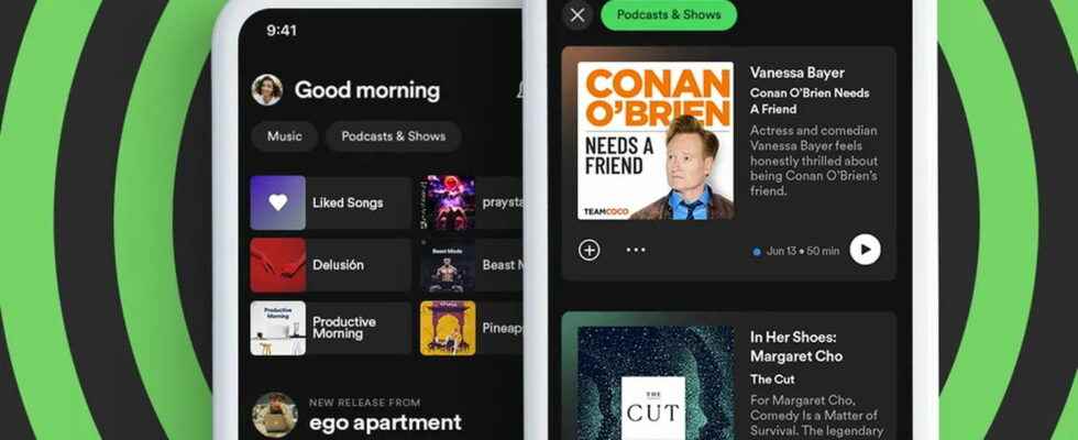
Spotify is rolling out a new interface for its mobile app. The home screen will now distinguish between music and podcasts to allow for better navigation and more discoveries.
Spotify continues to improve its interface little by little. The streaming music platform has just announced in a statement rolling out a new home screen for its mobile app that will give more prominence to podcasts. There will be two new buttons in a sidebar at the top of the screen – one for music and one for podcasts – which provide access to separate streams. The goal: to allow users “to further deepen their recommendations” by navigating more easily among the contents.
Spotify: separate streams for music and podcasts
In the end, it will be more about new filters than a real redesign of the home page. The flow Music will offer quick access to suggestions based on previously listened to songs so you can discover new favourites. . There will also be album and playlist recommendations as well as buttons to more easily share, “like” and start instant music playback.
As for the flow Podcasts and shows (Podcasts & Shows), it will give users direct access to the latest episodes of their favorite programs and offer them personalized recommendations. In addition, listeners will be able to access episode descriptions, save them to Your episodes and even start playing podcasts without leaving the page, so the experience starts from one place. This new interface is currently being deployed on Android, but it will still take a while for iOS devices because it will arrive “in the near future.”
