Internet giant Google introduced another logo today that those who do not look very carefully will not notice. This time Google Play logo renewed.
Google Play The logo has been updated to celebrate the service’s 10th birthday. The new logo, which you can see at the top of the gallery above, doesn’t look too different from the old one. In the new logo, slightly more rounded lines are preferred, at the same time the colors are made darker. With this minor change, we think the logo Google, which managed to make it more modernhas designed this logo with the focus on being compatible with the logos of its other services. The company, which creates its own design language for the logo, explains that Google Play serves 2.5 billion people in 190 different countries.
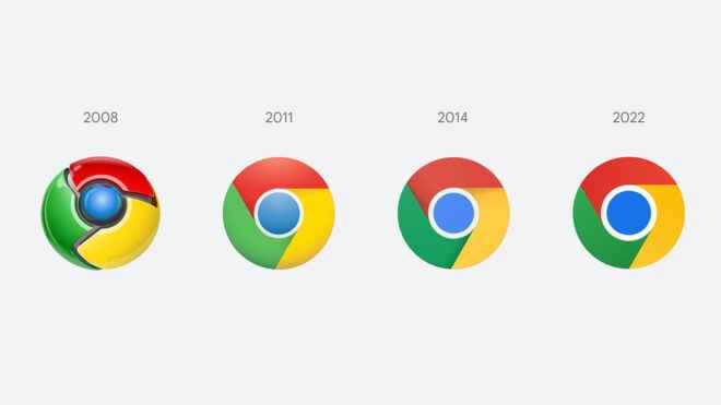
Before that about the logo Google Chrome was in focus. The iconic Chrome logo, which has become increasingly simple in its flat design focus, has switched to the 2022 version with the 100th version released in the past months. The biggest difference between the last logo passed in 2014 and the new logo passed in 2022, shadows were cast from the new logo. Apart from this, the company made the colors darker, and this design was the subject of ridicule in the internet world due to very minimal changes.
YOU MAY BE INTERESTED
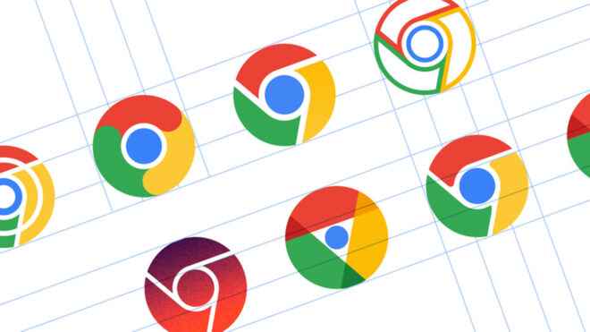
Googleas it turned out recently most He has also designed many different logos in the last period.. During the design phase of the new logo, the designs you see below were also on the agenda. The company, which seems to have made really interesting experiments here, did not want to move away from the familiar image in the last stage of logo design.


