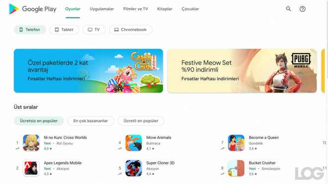
Google Play Store The new desktop design for the company was finally launched in Turkey. The old design now looked pretty bad.
the center of the android world Google Play Store for desktop version entered from browsers The new design, which has been passed for, looks much simpler and, accordingly, modern. Dividing the new page into four different categories at the top, Google also divides the market into four different devices. In the new design, which includes small visual designs for the featured content, “the most popular free, the most popular and the most popular paid” applications / games are highlighted. The design, which highlights a lot of applications and games when scrolled down, also includes sections at the bottom, such as the company’s “selected from May games” and “independent productions we love”.
Google Play Store recently for privacy oriented one step had been taken. According to the announcement put into use applications in the new era,securityIt will clearly show you all the data they will collect / process about you through the ” section. Here are also key details that the app can access from the phone (Location, photos etc.) will also be displayed as active.
YOU MAY BE INTERESTED
The company, which generally creates a modern line here, will also highlight the special security measures used by application developers in the process. For example, if the application encrypts your data, this detail will be made publicly available to the user. At the same time, the suitability of the application for children is among the details that will be clearly stated. It is explained that this step, which is based on the Play Store, will take some time for the process to reach everyone.
